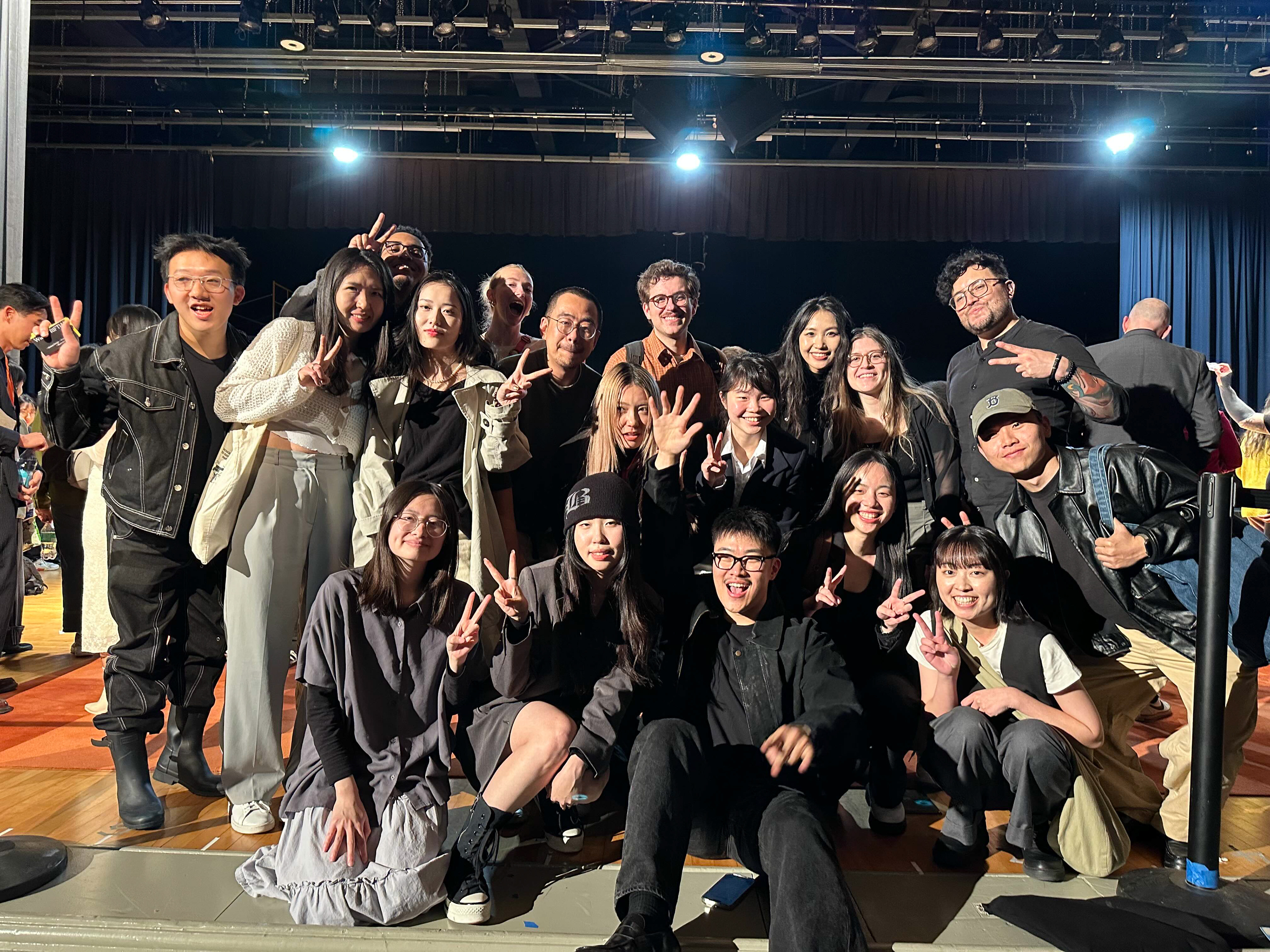
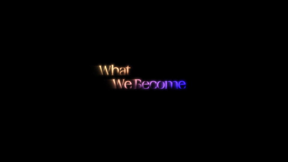
group project
Comotion 2025 Branding team
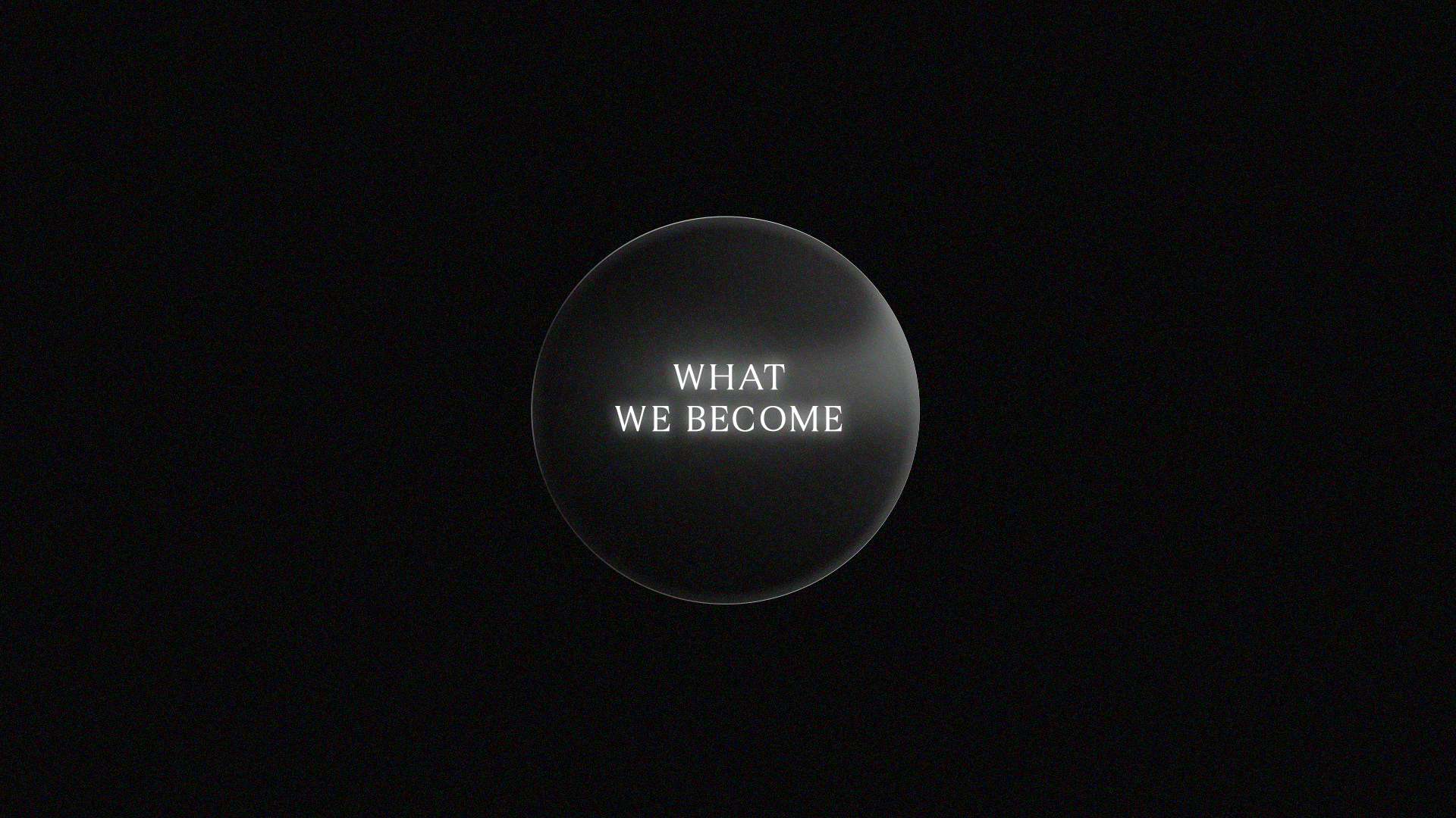
style frames for title sequence
Role
Designer
CoMotion is a student-led motion graphics conferences hosted by MOMELove at SCAD. I worked in the design team creating style frames for
the main title sequence. It was an honor and a blast to be part of this talented team of 40 people.
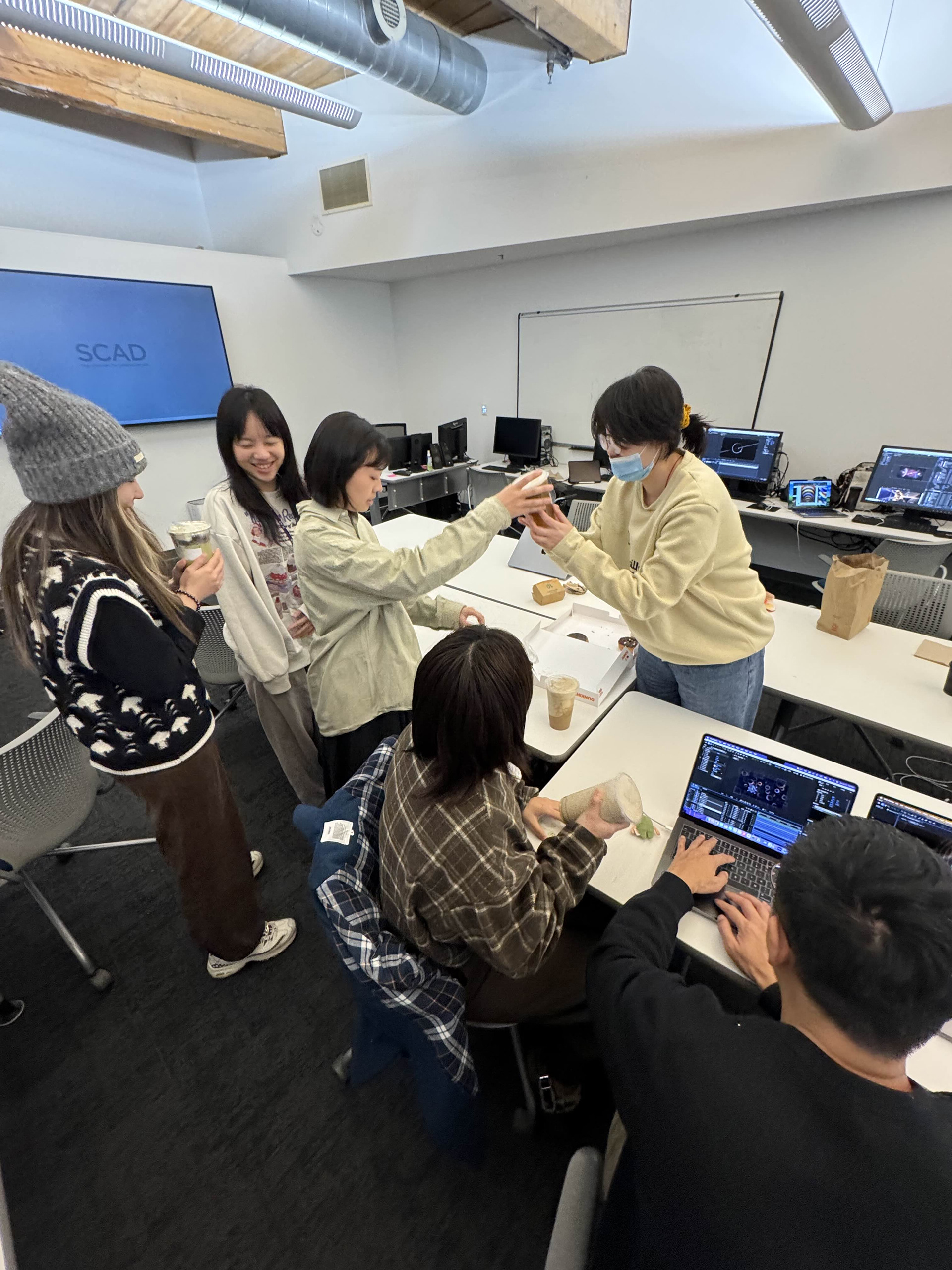
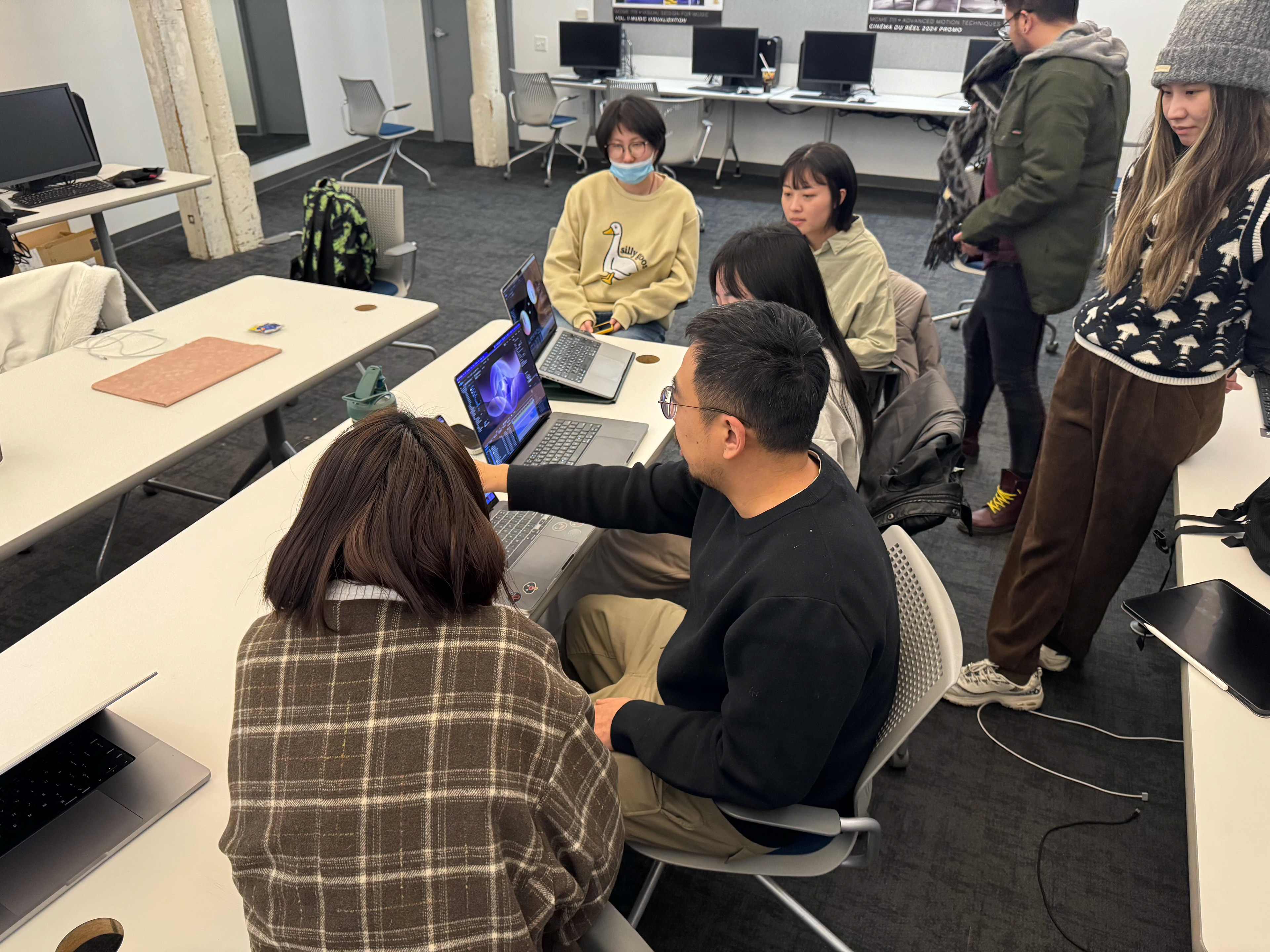
Role as a designer
As a designer on the CoMotion Branding Team, I collaborated with the creative director and design team leader
for about three months to create style frames for the title sequence.
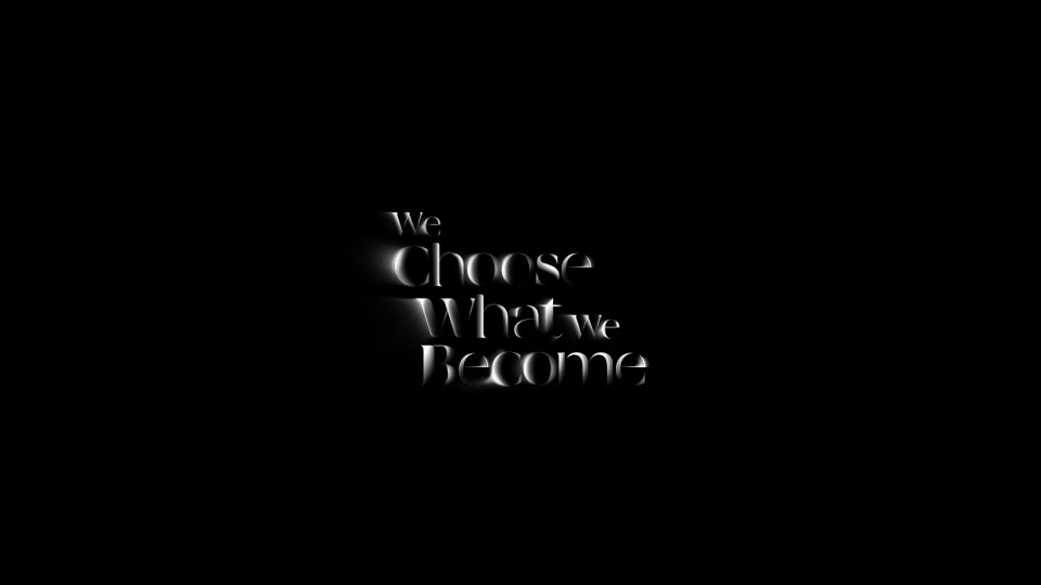
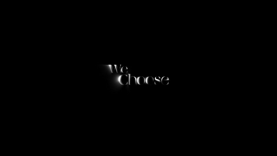
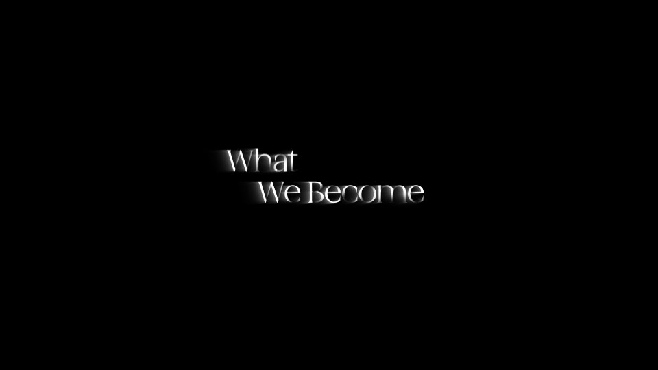
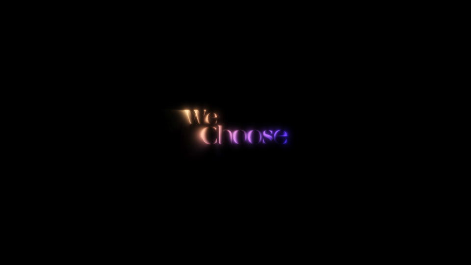
For four shots, I translated the concept of the title sequence - Face, Choose, Become - into a visual language,
conducting reference research, designing compositions, and creating style frames. Additionally, for animation,
I created all design assets in After Effects.
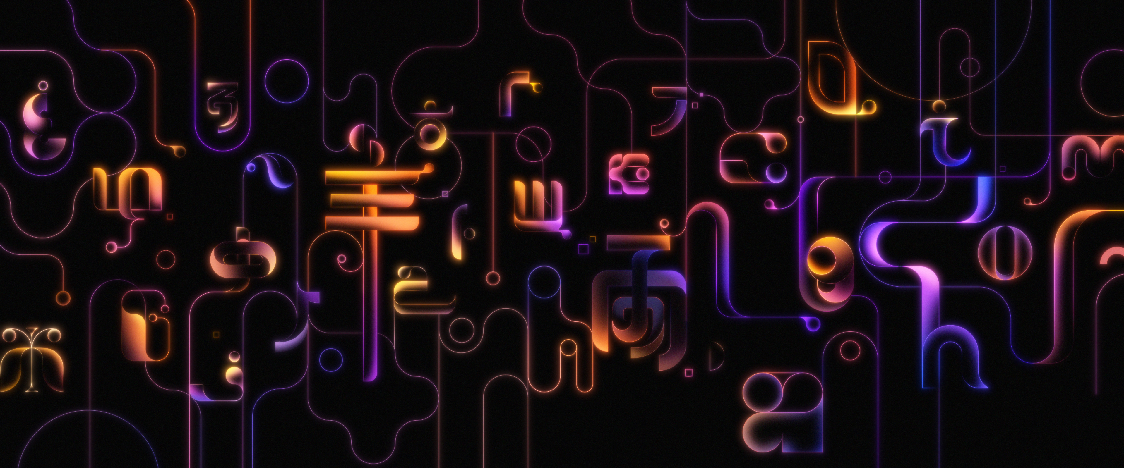
Style Frames I worked on
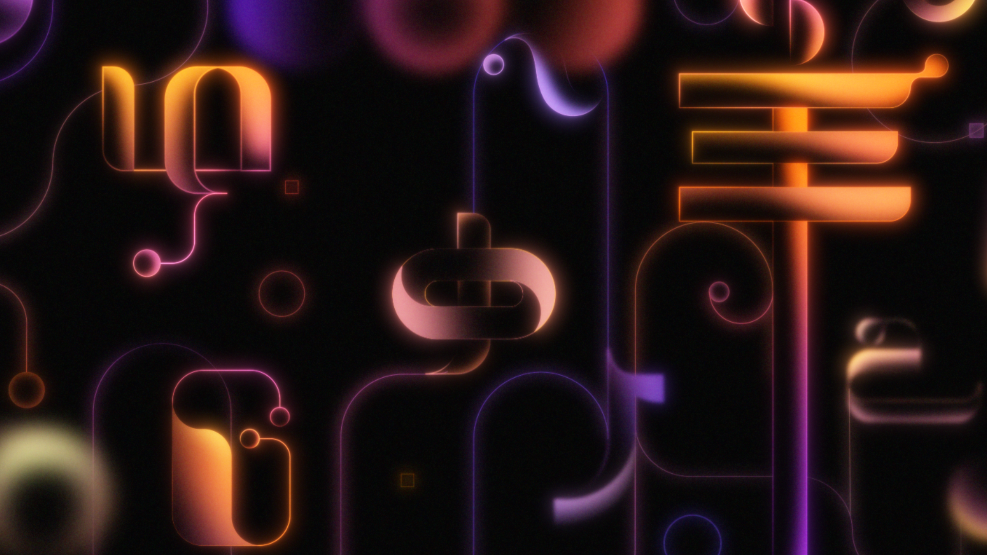


Style Frames for Shot 35
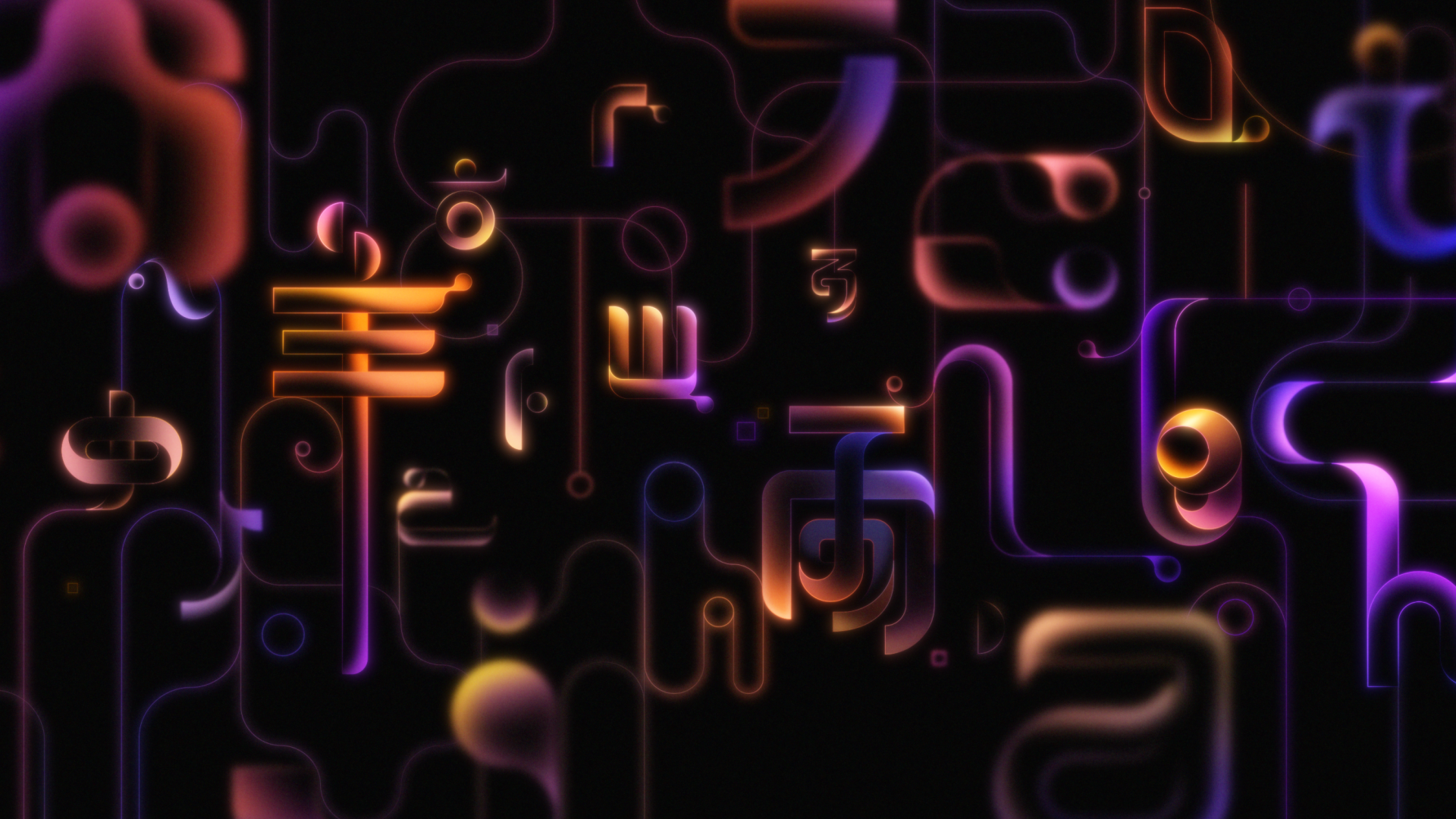
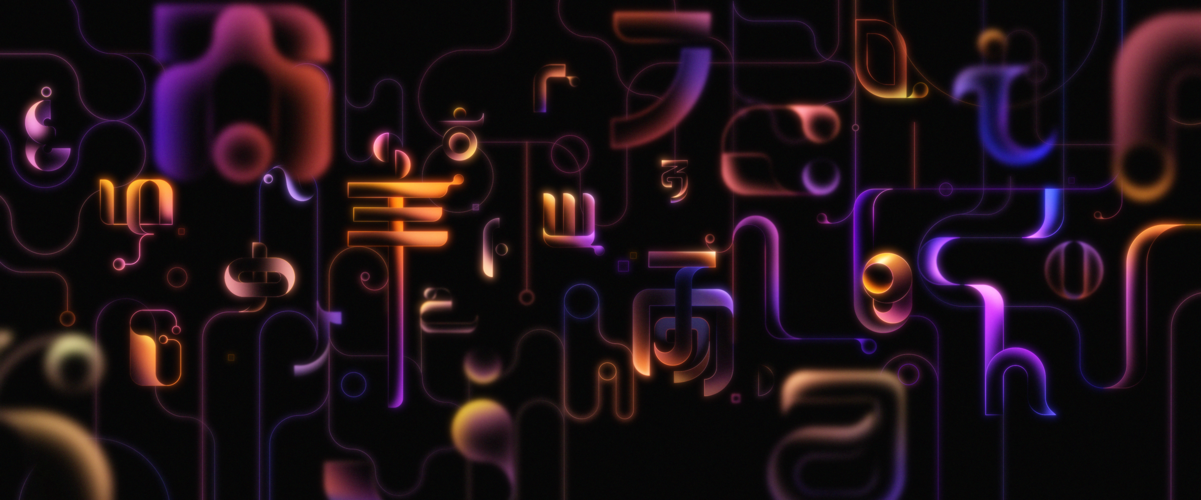
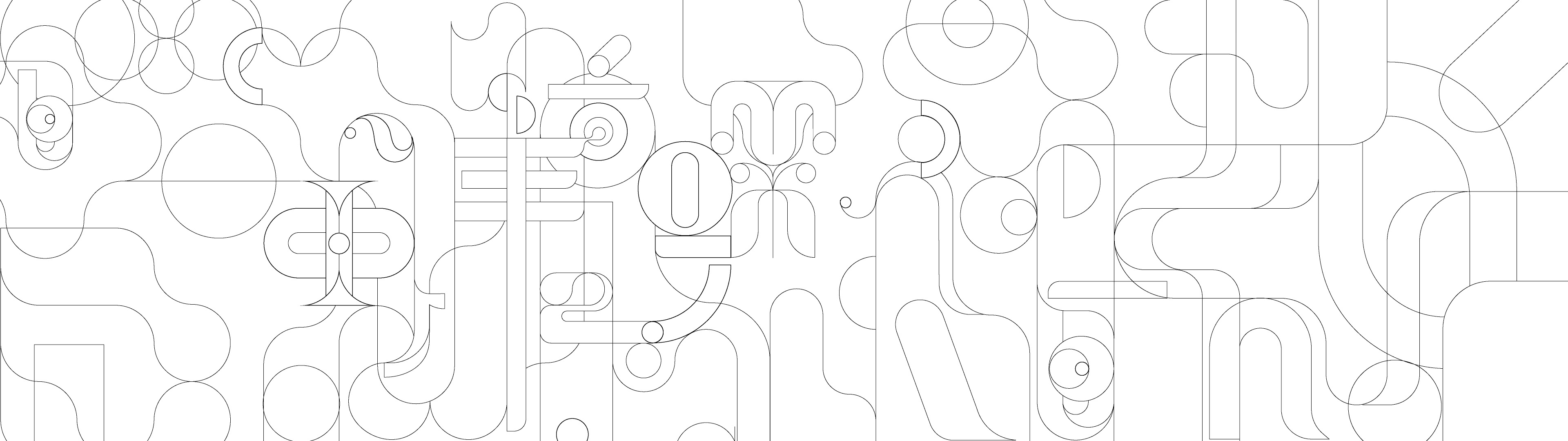
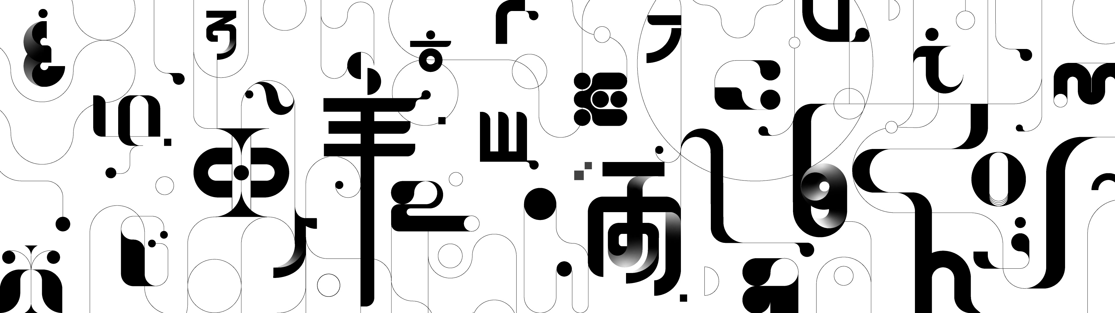
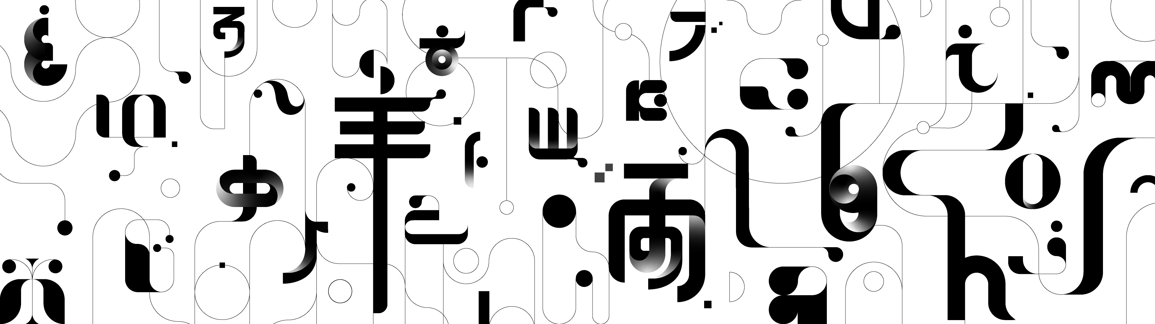
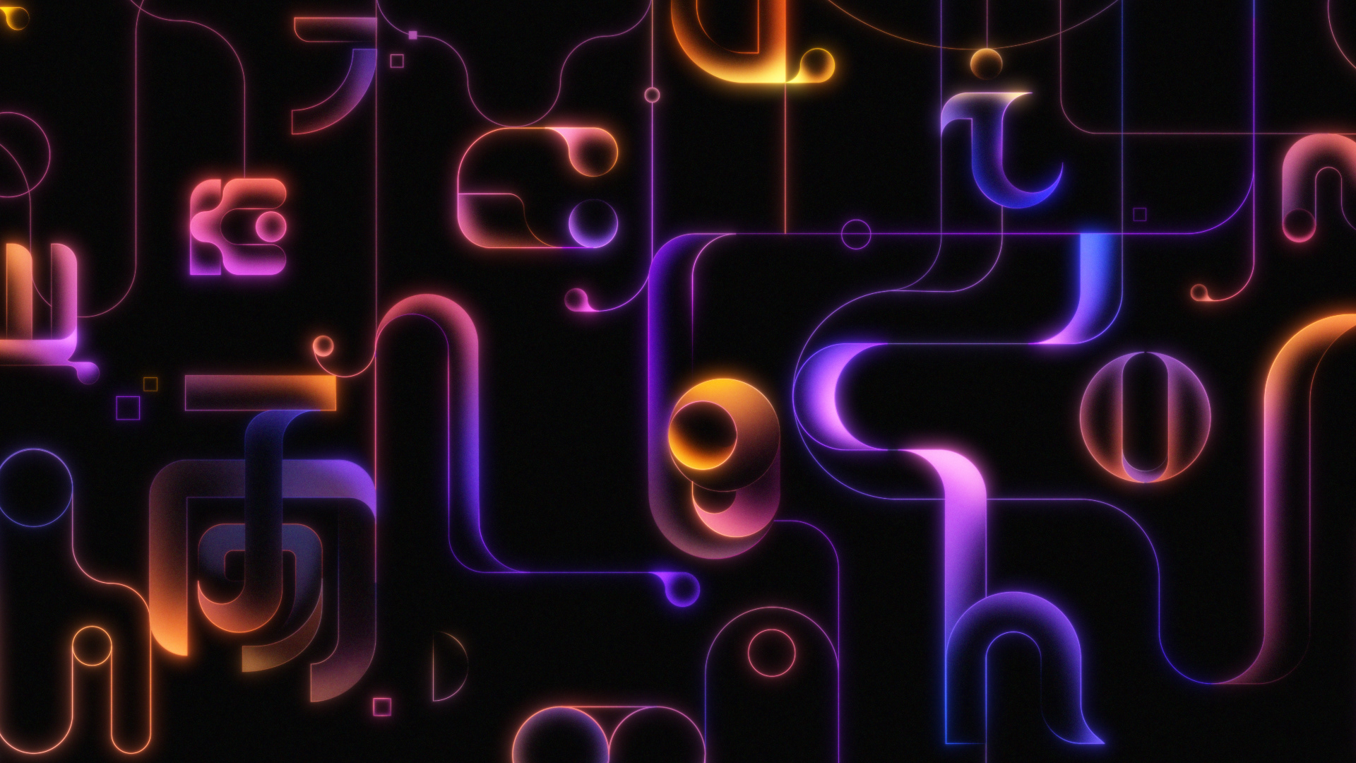
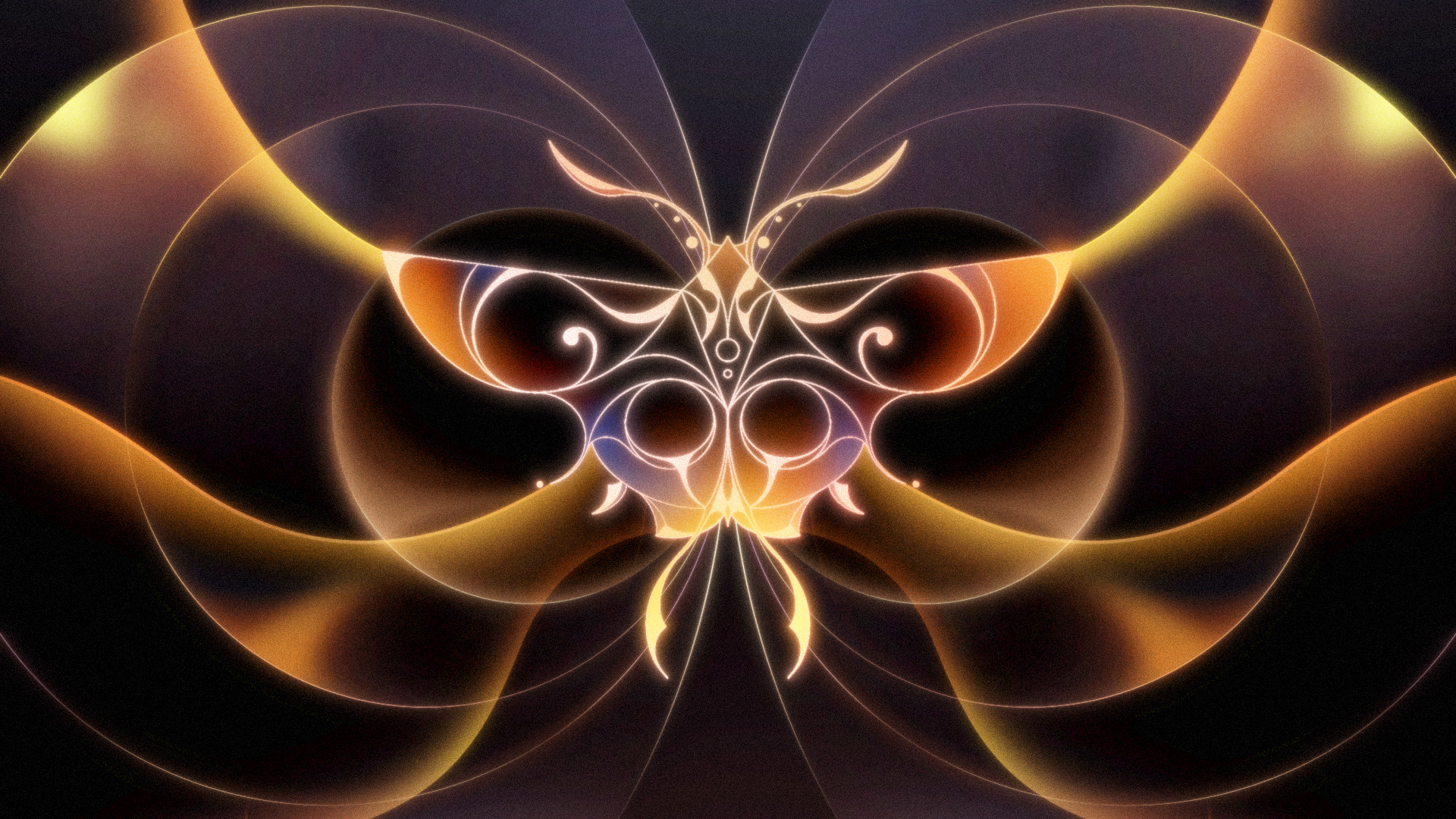
Following the concept of Shot 35, which represents people from different places and languages connecting and becoming
one, I designed typography in various languages including English, Korean, Chinese, Japanese, Arabic, Cyrillic, Hebrew, and Tamil.
To align with the abstract and minimalist concept of the title sequence, I decoded the typography of each language into a unified
design by combining minimal geometric and curved forms. Additionally, to create a visual connection with Shot 34, I incorporated
curves and linked all typography, allowing each character to interweave, forming a shared space and ultimately merging into one.
Reference Research & Compositions
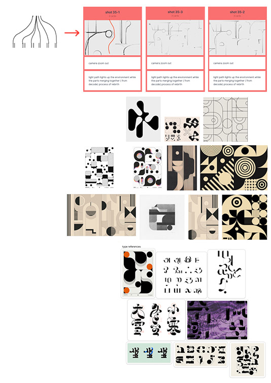
Style Frame Development
Finalized Style Frames


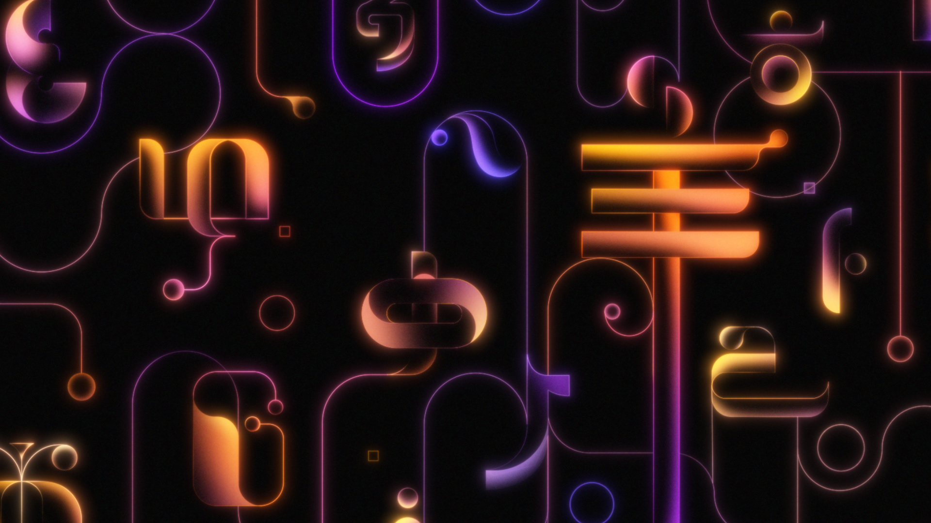
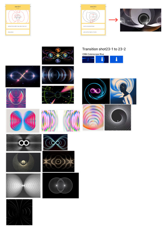
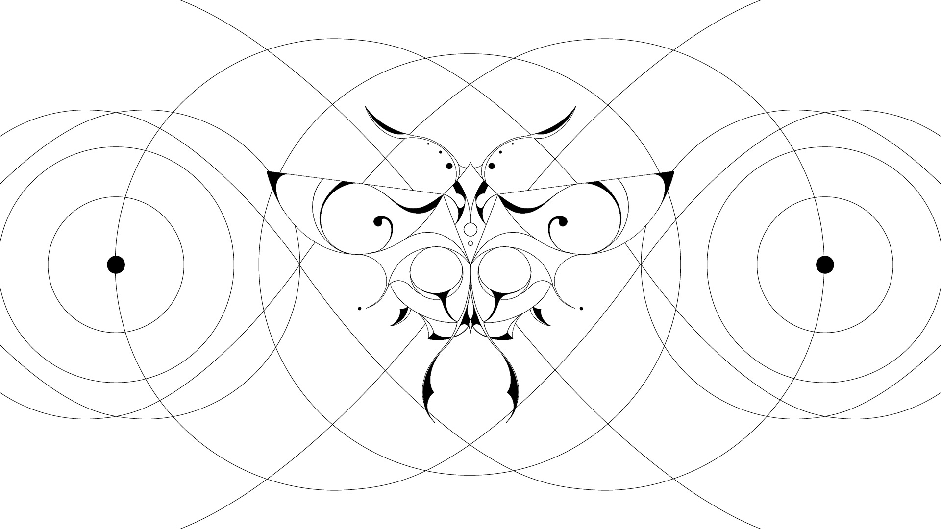
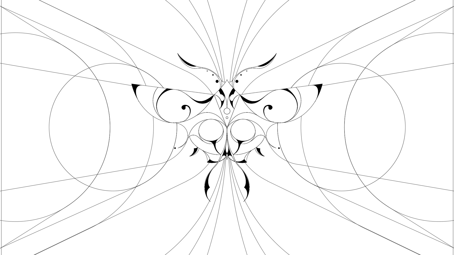
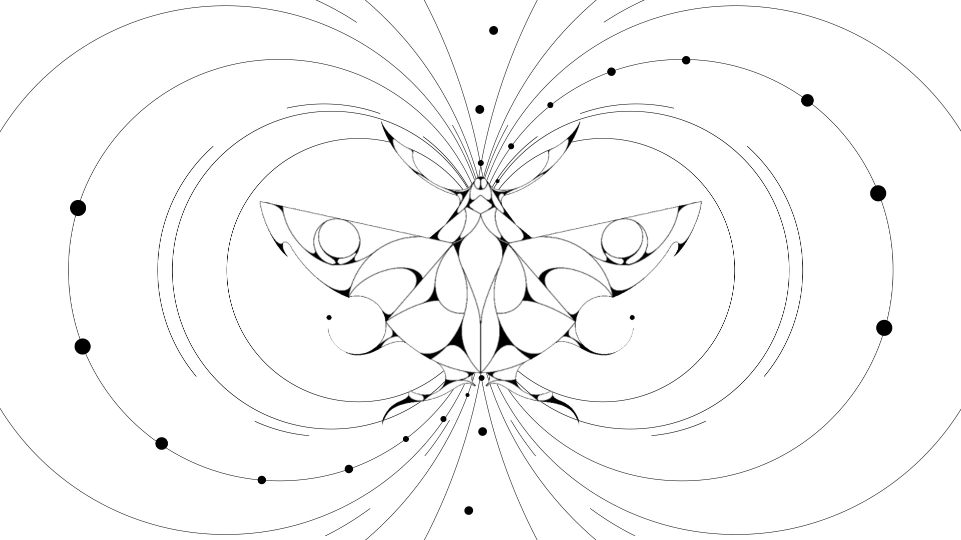
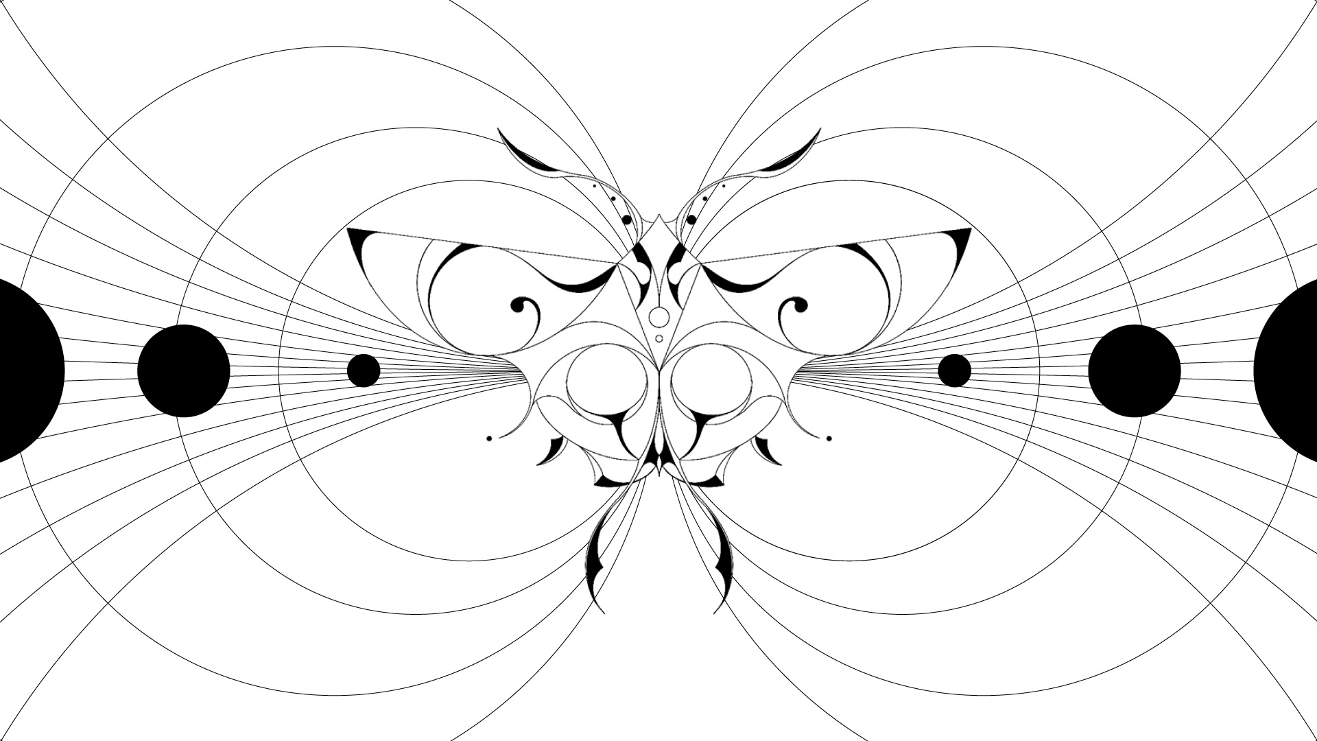
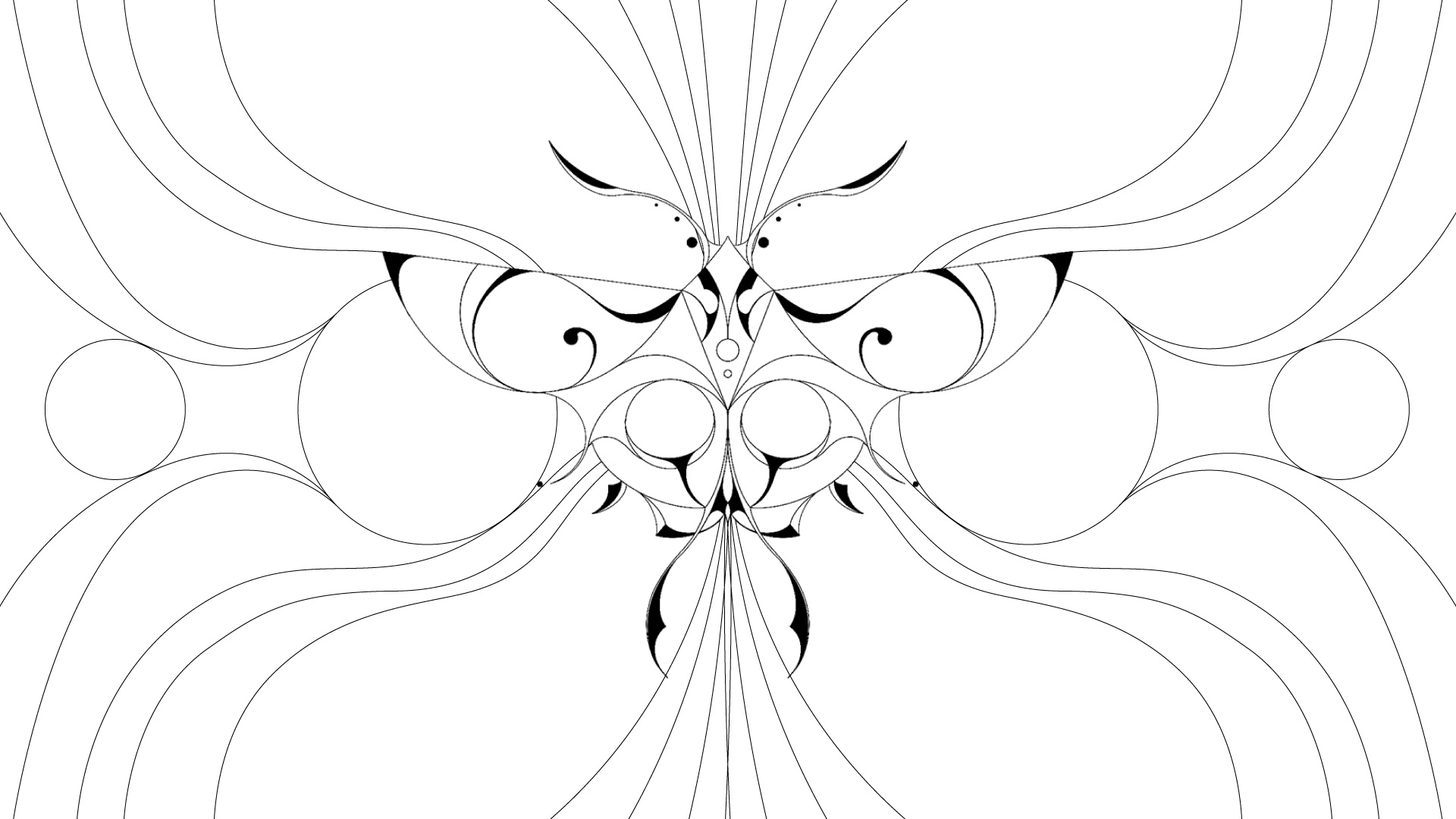
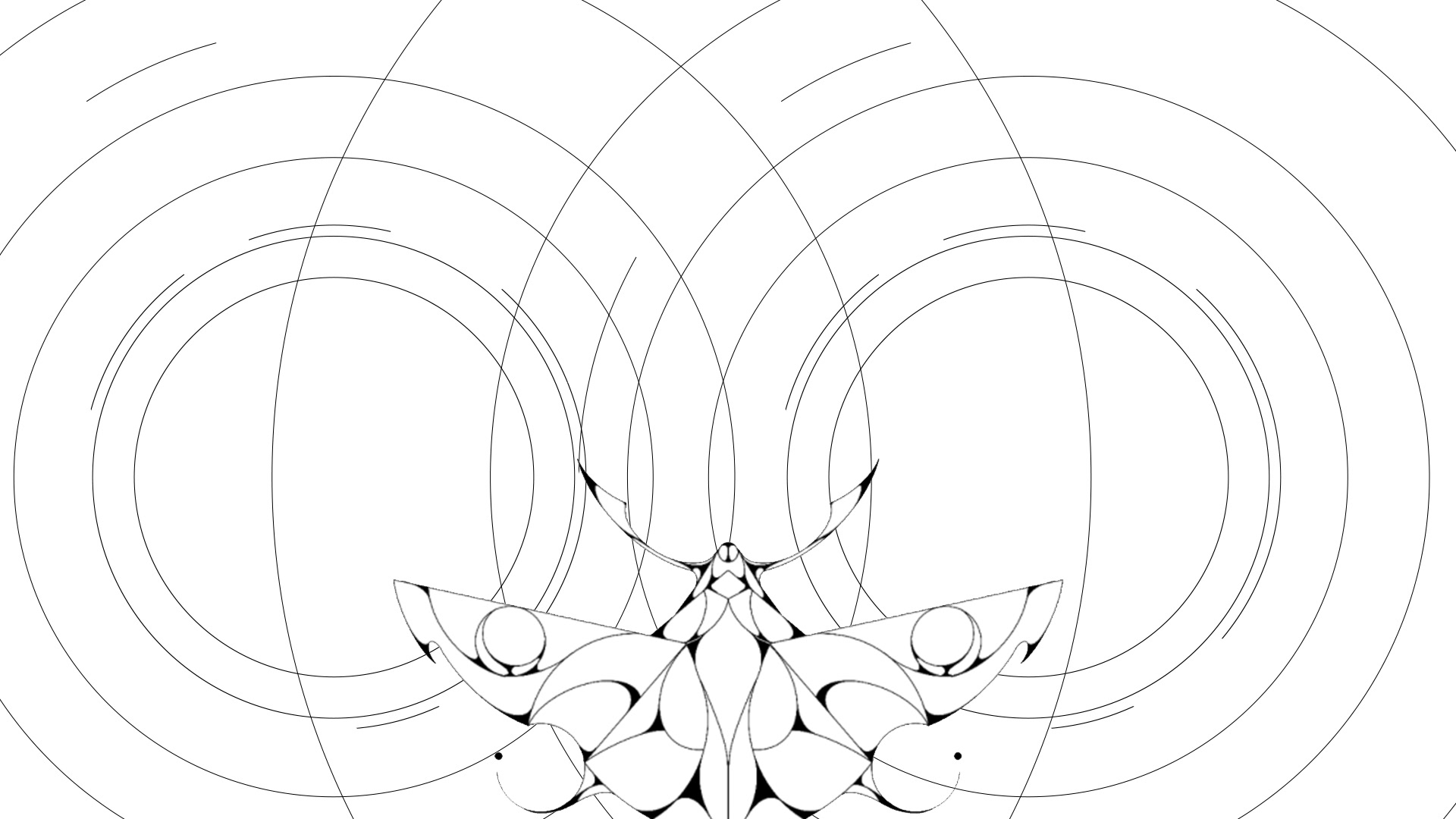
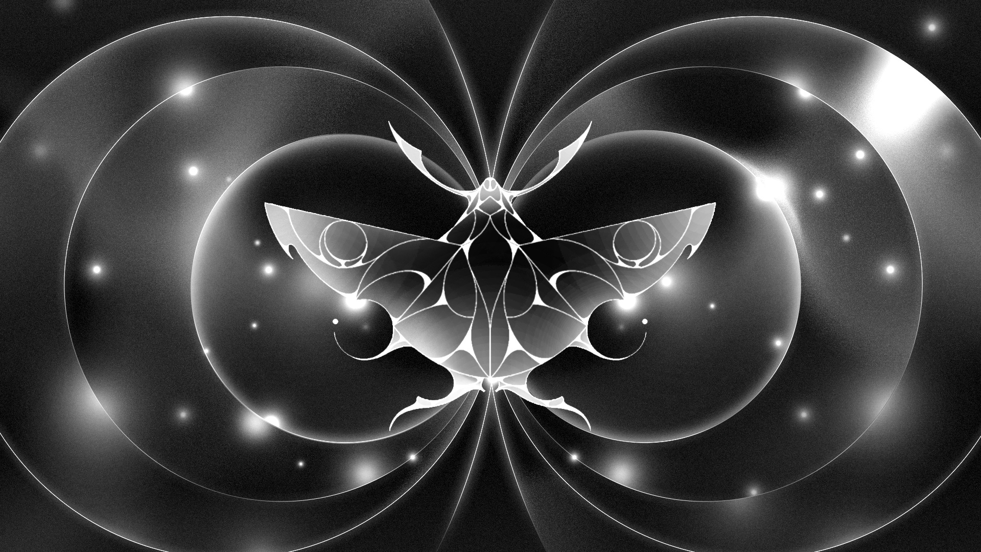
Style Frames for Shot 23
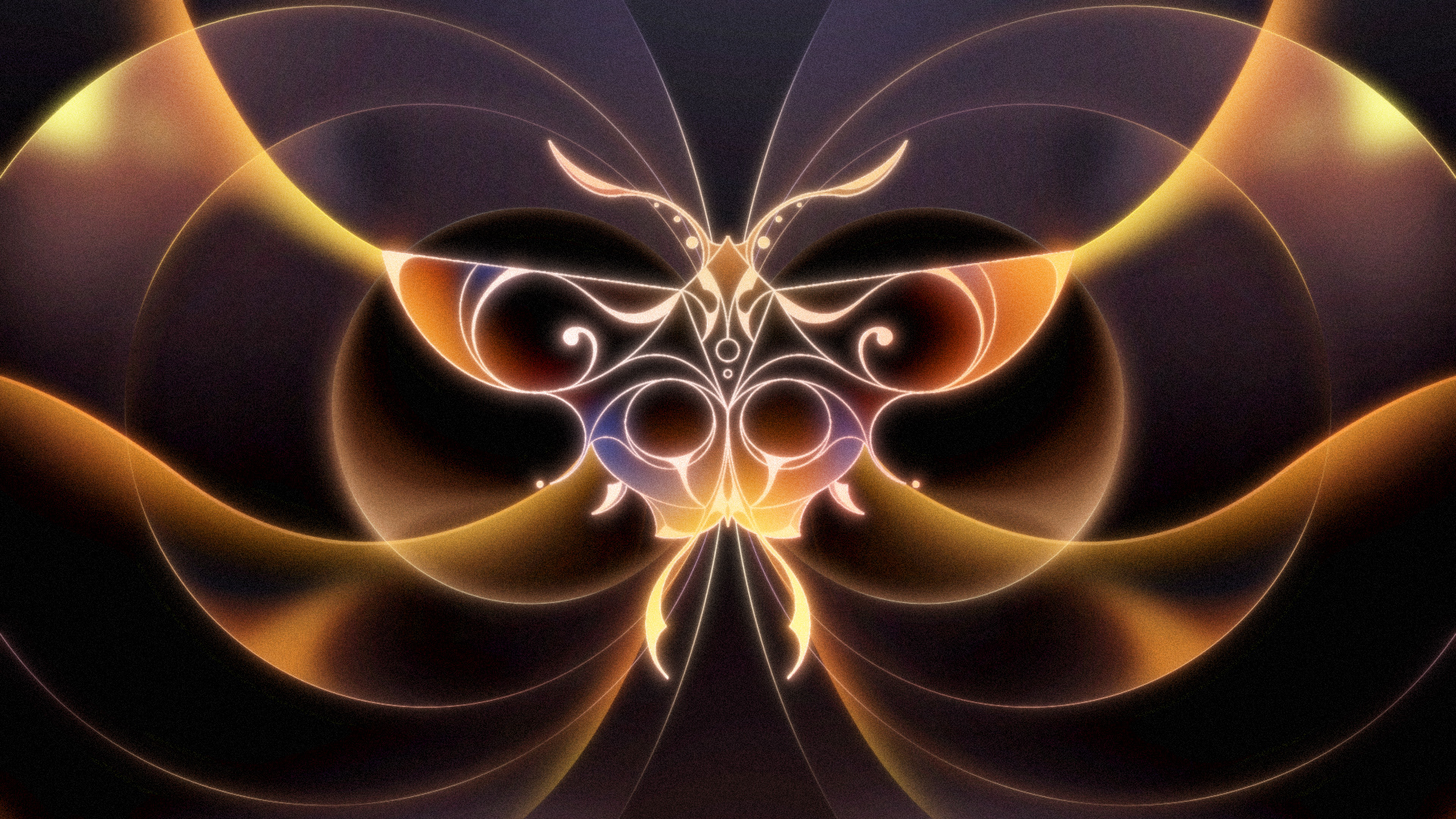
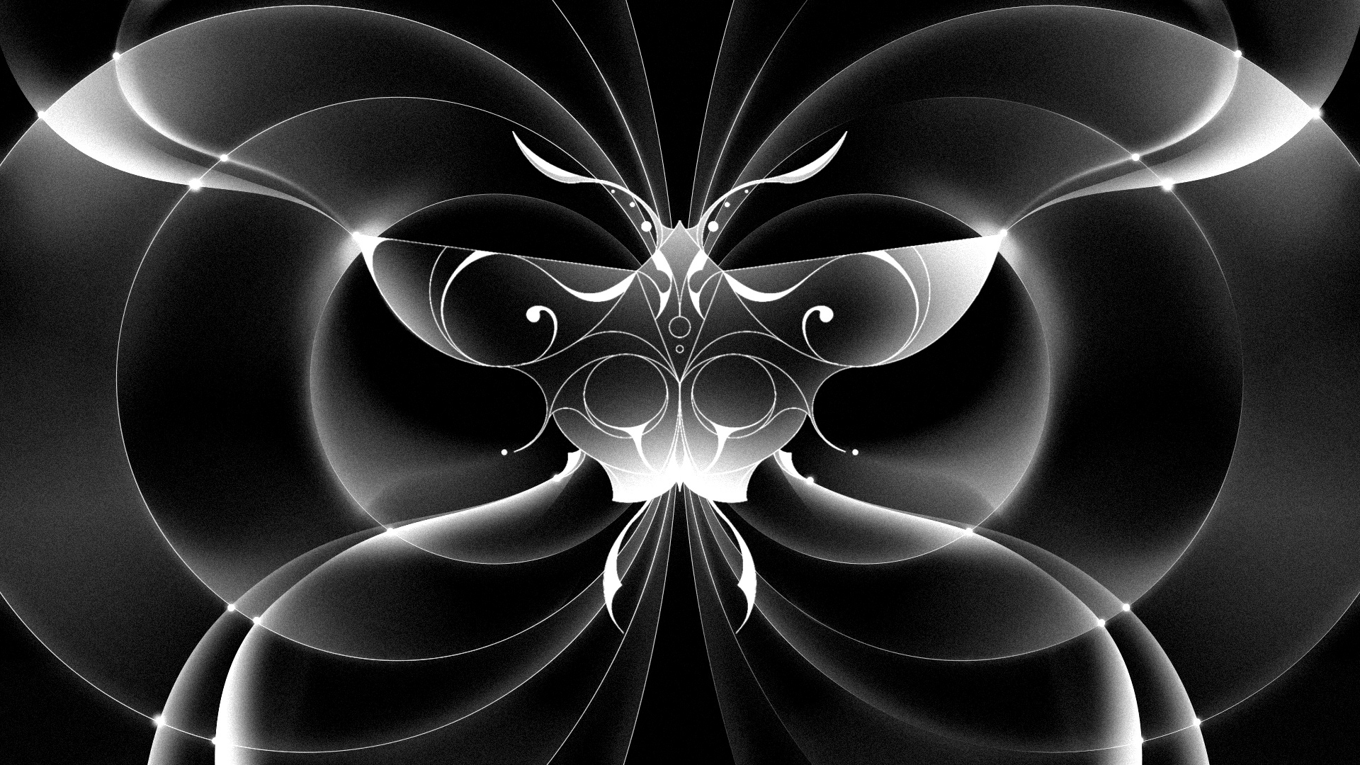
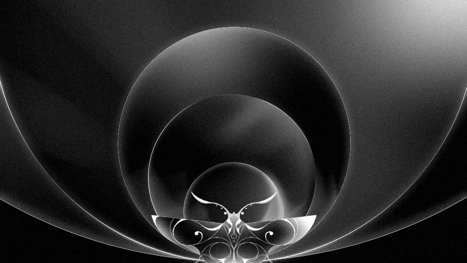
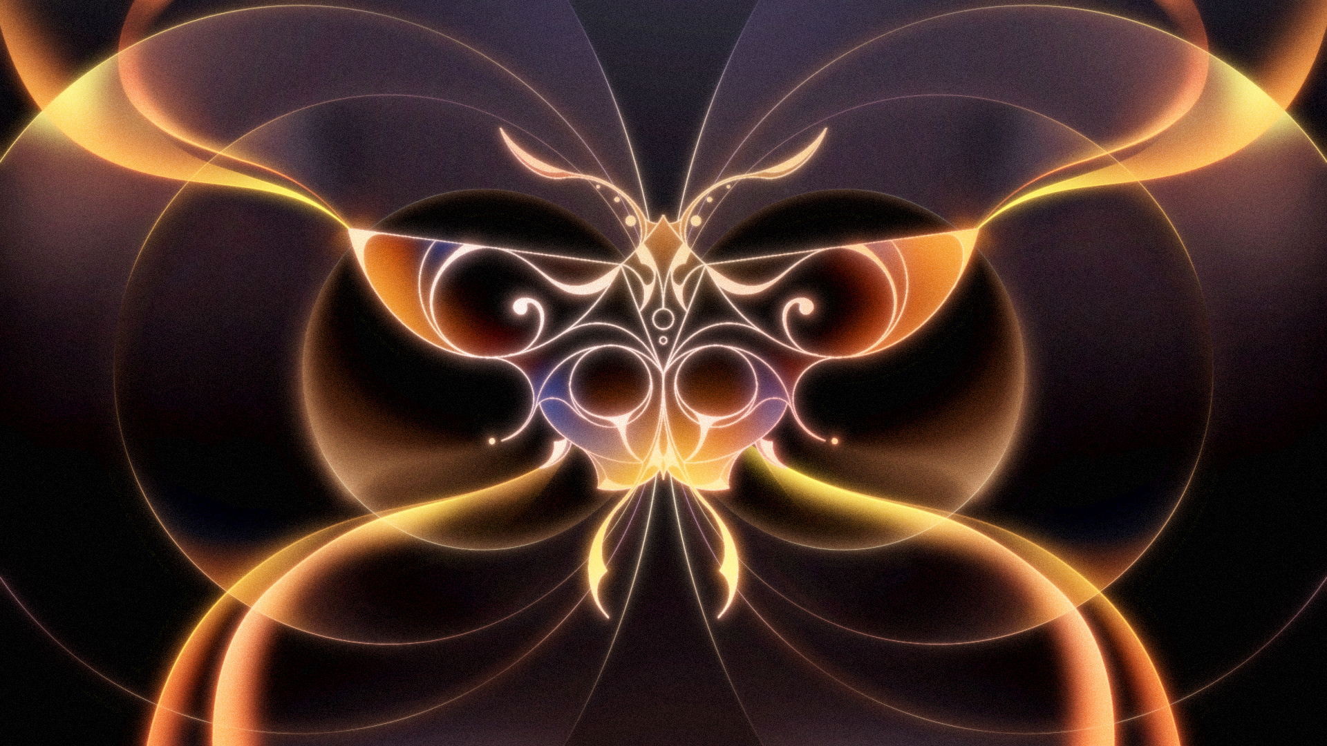
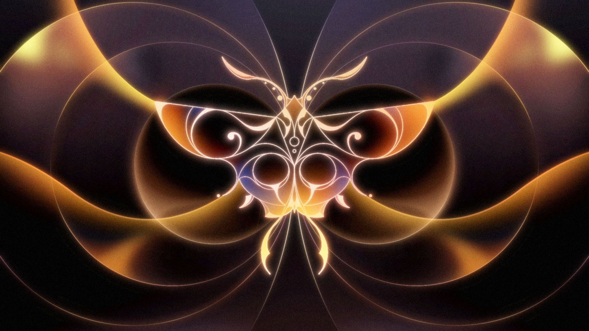
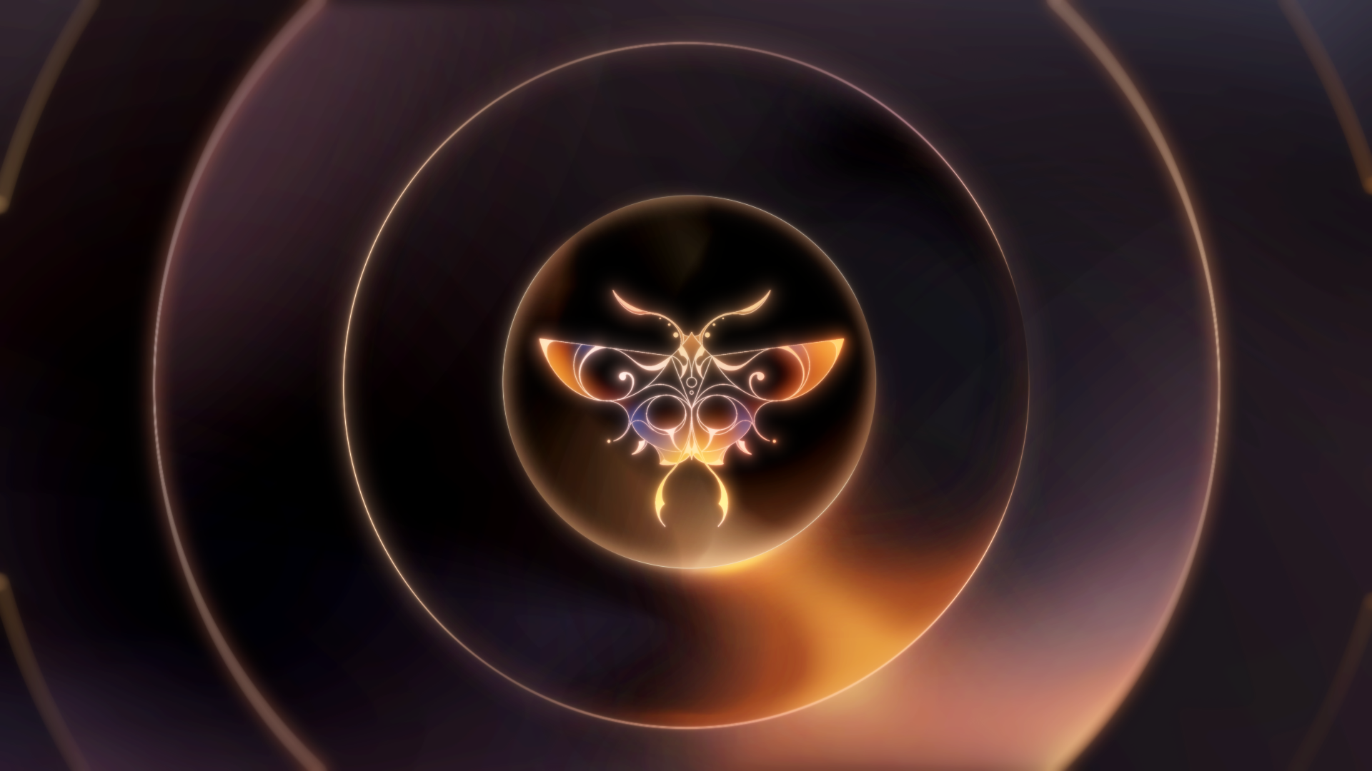
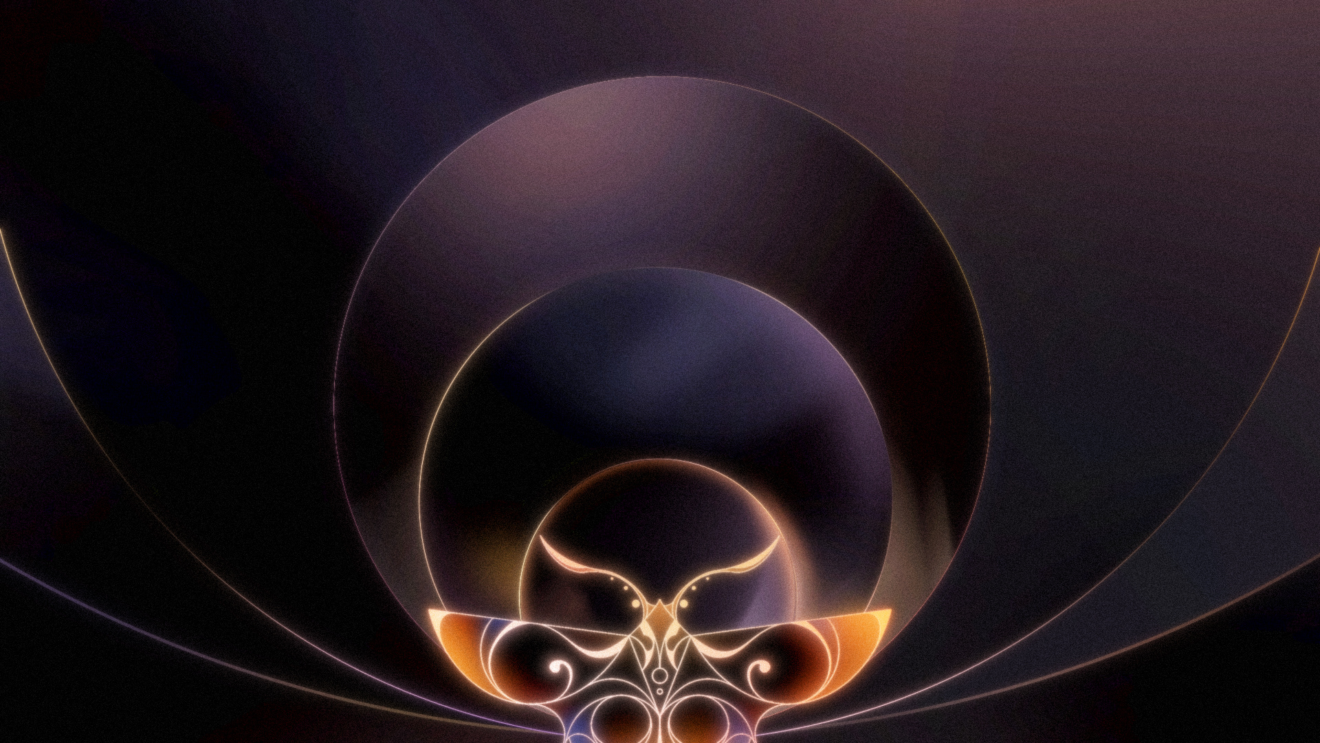
Based on the initial storyboard, I researched references to express the wing's wave, studying the lines and movements.
Then, I created several compositions. To align with the minimalism concept of the title sequence, I minimized the lines while
adding curved lines extending from the wings to emphasize the power of the moth's wings. Additionally, to ensure a smooth
transition into the circular shapes in the background of Shot 24, I planned and designed how the circles would come together
in Shot 23. Additionally, I planned and designed the transition of the circles from Shot 23 to Shot 24.
Reference Research & Compositions
Style Frame Development
Finalized Style Frames


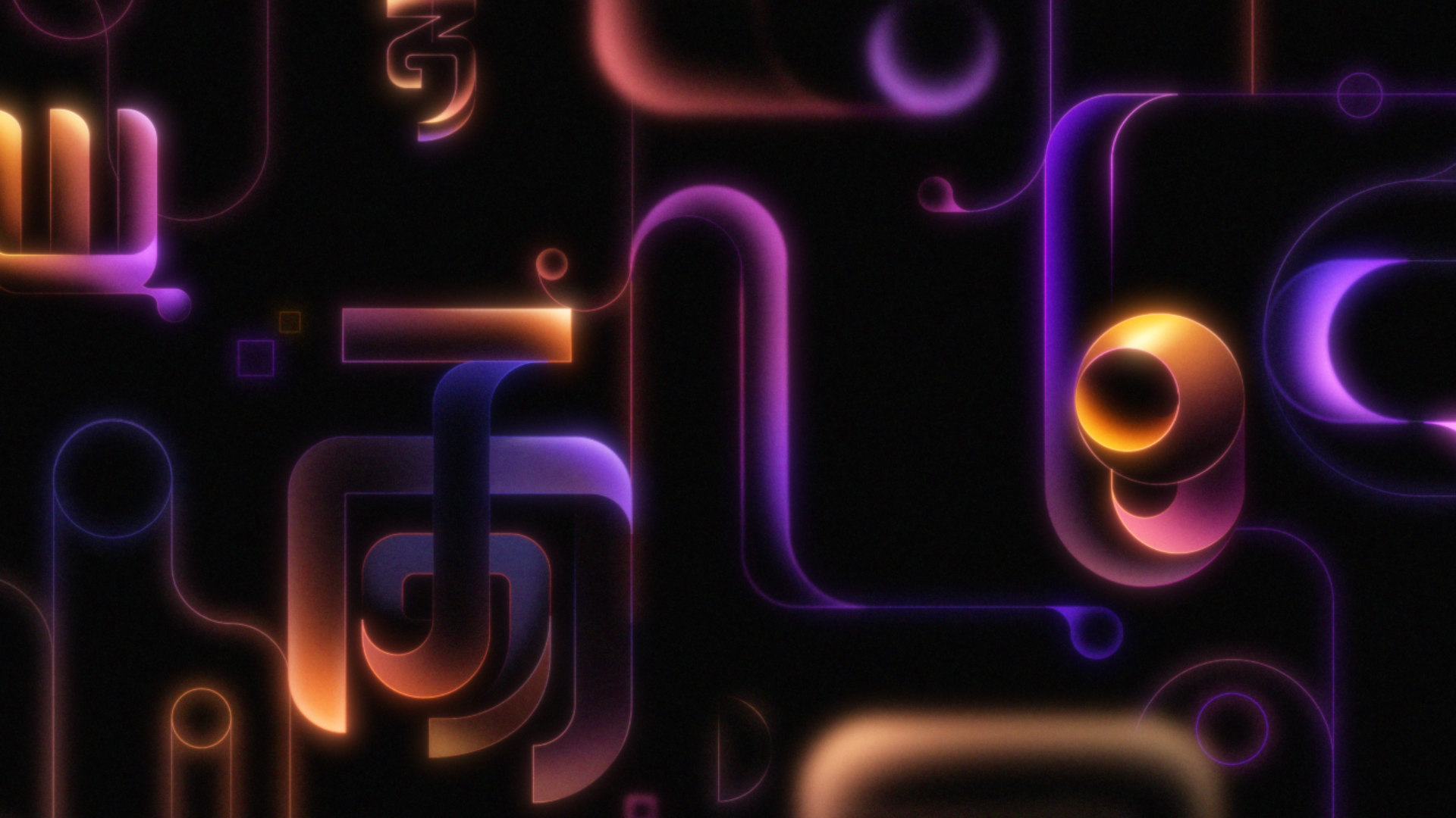
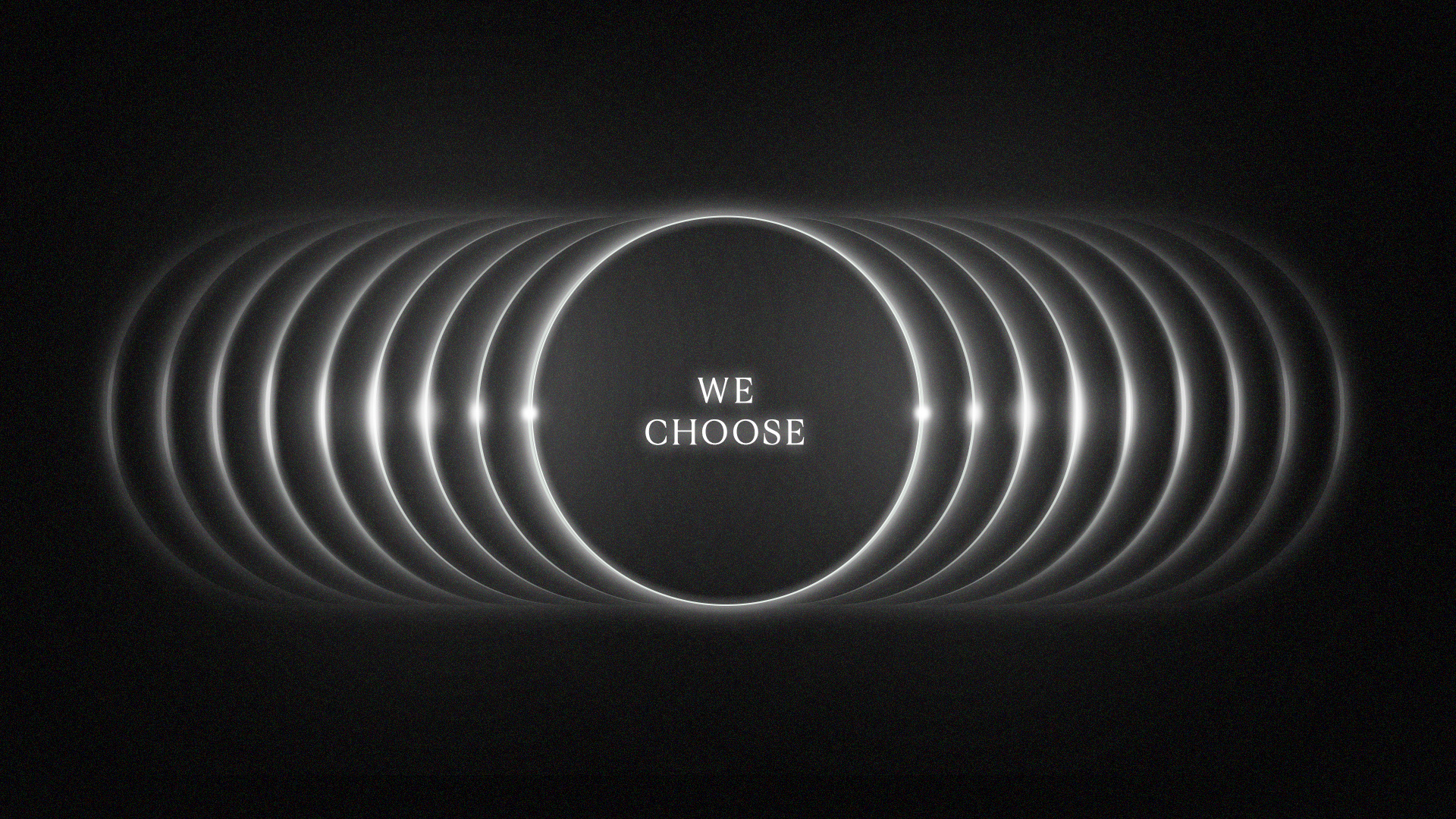
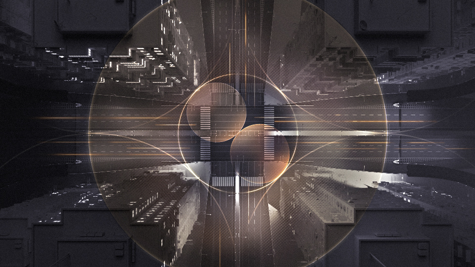
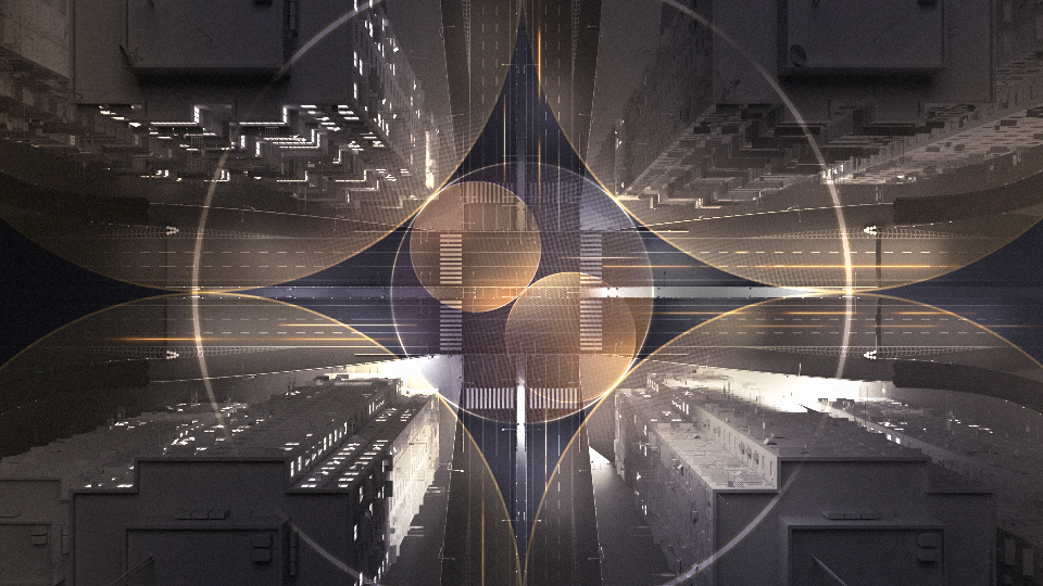
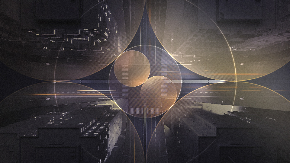
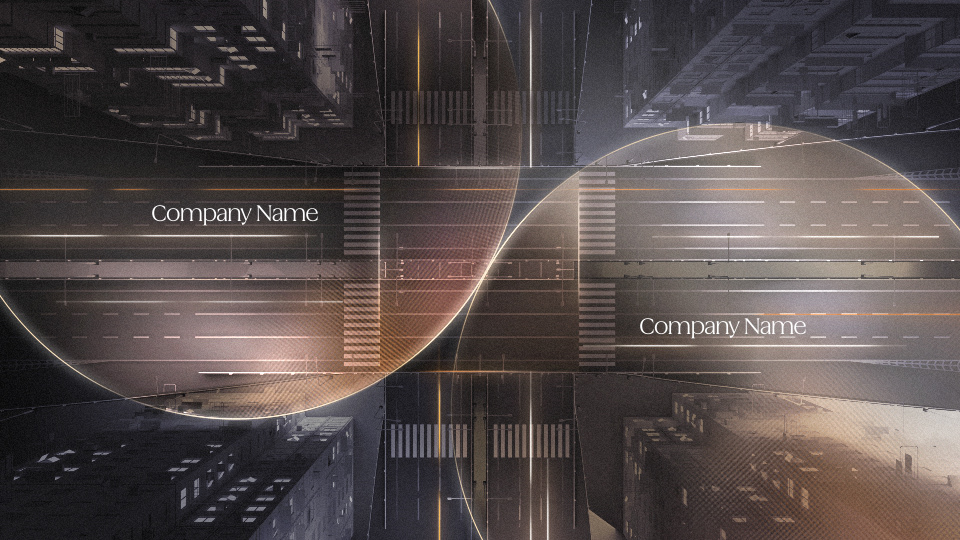
Style Frames for Shot 01 & 16
Shot 01, an intro design using only typography, was initially composed with lines. However, reflecting
the creative director's feedback to focus solely on typography, I applied a light diffusion effect to enhance the design.
In Shot 16, where 2D overlays were applied on top of the 3D render, I designed a light-converging effect toward the
central square to create a smooth transition into the Chapter Two' square design of Shot 17.
Style Frame Development

Finalized Style Frames

Credit
Client: Savannah College of Art and Design
Creative Director: Rivai Li, Chiyao Lien
Producer: Lola Coleman, Annalise Kristensen
Design Lead: Jinkyu Kang
Lead Animator: Gage Bowman
Lead Graphic Designer: Brooke Niblock
3D Modeler and Rigger: Tris Zhou
Animators: 6AM, Valentina Gil, Siyu Liu, Jannah Manneh, Jace Park, Sean Shelton, Davis Hardy, June Kim,
Aarya Nagre, Yichen Shi
Design Art Director: Jieru Tang
Designers: Yumi Kim, Cassie Liu, Lu Lu, Cristian Sandoval, Clair Yang, Haohao Yu
Graphic Design Art Director: Wildy Riftian
Graphic Designers: Casey Fuller, Devika Kulkarni, Hungchi Li, Alessia Priccoliori, Anannyaa Shetty
Experiential Lead: Eleanore Matthews
Experiential: Chris Atkinson, Kechen Chen, Julee Lee
Web Developers: Austin De Nijs, Navione White
Composer: Julia Belle
Documentary: Demani Rawlins